Box / Violin · 箱线图 / 小提琴图#strip-plot#jittered-scatter#median-annotation#two-column
Paper-Espresso · Strip plot of topic time-to-peak vs half-life
Paper-Espresso · 话题 Time-to-Peak 与 Half-life 的散点带图
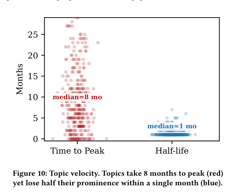
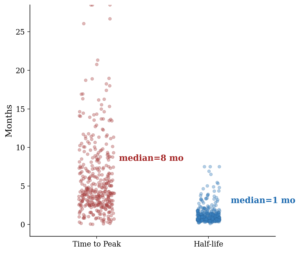
Reproduction of arXiv:2604.04562 Figure 10. Two horizontal strip / swarm columns (Time to Peak in red, Half-life in blue) of per-topic month counts. Points are jittered with low alpha to expose density; bold coloured median annotations are pinned next to the densest band of each column (median = 8 mo vs median = 1 mo).
arXiv:2604.04562 Figure 10 复现。两列横向散点带图(Time to Peak 红、Half-life 蓝)展示每个话题的月份计数。点位水平 jitter,低 alpha 让密度可见;每列在密度最大处贴上同色加粗的 median 标注(median = 8 mo vs median = 1 mo)。
@paper · 来自论文
Paper Espresso: From Paper Overload to Research Insight
Paper Espresso:从论文过载到研究洞见
Du et al. (Paper Espresso Authors) · arXiv 2026
// original from paper · 论文原图
// reproduced via paperespresso_swarm.py · 脚本复现download png
paperespresso_swarm.py
"""Reproduction of Paper-Espresso Figure 10 (Topic velocity strip plot).

Anonymised reproduction of arXiv:2604.04562 Figure 10:
Two horizontal strip / swarm columns ("Time to Peak", "Half-life") of
per-topic month counts, with a transparent jittered scatter and bold
median annotations pinned next to the highest density of each column.

All point counts are sampled from a synthetic two-mode distribution that
mirrors the published medians (8 vs. 1 month) and visible tail of the
underlying figure. No external CSV / API / checkpoint is touched.
"""

import numpy as np
import matplotlib.pyplot as plt

rng = np.random.default_rng(0)
plt.rcParams.update({
    "font.family": "serif",
    "font.size": 11,
    "axes.linewidth": 1.0,
})

def time_to_peak(n=380):
    body = rng.lognormal(mean=np.log(8.0) - 0.32, sigma=0.65, size=int(n * 0.78))
    bursty = rng.uniform(0.0, 4.5, size=int(n * 0.22))
    months = np.concatenate([body, bursty])
    return np.clip(months, 0.05, 28.5)

def half_life(n=420):
    bulk = rng.lognormal(mean=np.log(1.0) - 0.20, sigma=0.45, size=int(n * 0.82))
    long_tail = rng.lognormal(mean=np.log(2.5), sigma=0.55, size=int(n * 0.18))
    return np.clip(np.concatenate([bulk, long_tail]), 0.05, 7.5)

ttp = time_to_peak()
hlf = half_life()

xj_ttp = 0 + rng.uniform(-0.16, 0.16, size=len(ttp))
xj_hlf = 1 + rng.uniform(-0.10, 0.10, size=len(hlf))

fig, ax = plt.subplots(figsize=(6.4, 5.4))

ax.scatter(xj_ttp, ttp, s=22, color="#b14747", alpha=0.40,
           edgecolor="#7d2c2c", linewidth=0.30, zorder=3)
ax.scatter(xj_hlf, hlf, s=22, color="#3a82c2", alpha=0.40,
           edgecolor="#1d4e7e", linewidth=0.30, zorder=3)

ax.text(0.20, 8.6, "median=8 mo", fontsize=12.5, fontweight="bold",
        color="#a52727", ha="left", va="center")
ax.text(1.20, 3.1, "median=1 mo", fontsize=12.5, fontweight="bold",
        color="#1f6cb1", ha="left", va="center")

ax.set_xticks([0, 1])
ax.set_xticklabels(["Time to Peak", "Half-life"], fontsize=13)
ax.set_xlim(-0.6, 1.6)
ax.set_ylim(-1.5, 28.5)
ax.set_yticks(np.arange(0, 30, 5))
ax.set_ylabel("Months", fontsize=13)

for s in ["top", "right"]:
    ax.spines[s].set_visible(False)
ax.spines["left"].set_color("#222")
ax.spines["bottom"].set_color("#222")
ax.tick_params(axis="both", labelsize=11, color="#222")

plt.tight_layout()
plt.savefig("paperespresso_swarm_repro.png", dpi=200, bbox_inches="tight")
print("saved paperespresso_swarm_repro.png")